
Hill City Vets – Brand Design
Brand Identity
Website Design
Print Design
Art Direction
Signage
Copywriting
Website: Hill City Vets
Photography: Angus BremnerNew pups on the block.
Though new startups are not usually our focus, the chance to work with Lindsay and JP on their new independent veterinary practice and the possibility of a really interesting brand was too exciting a prospect to pass up. Plus we are pretty into tiny dogs.
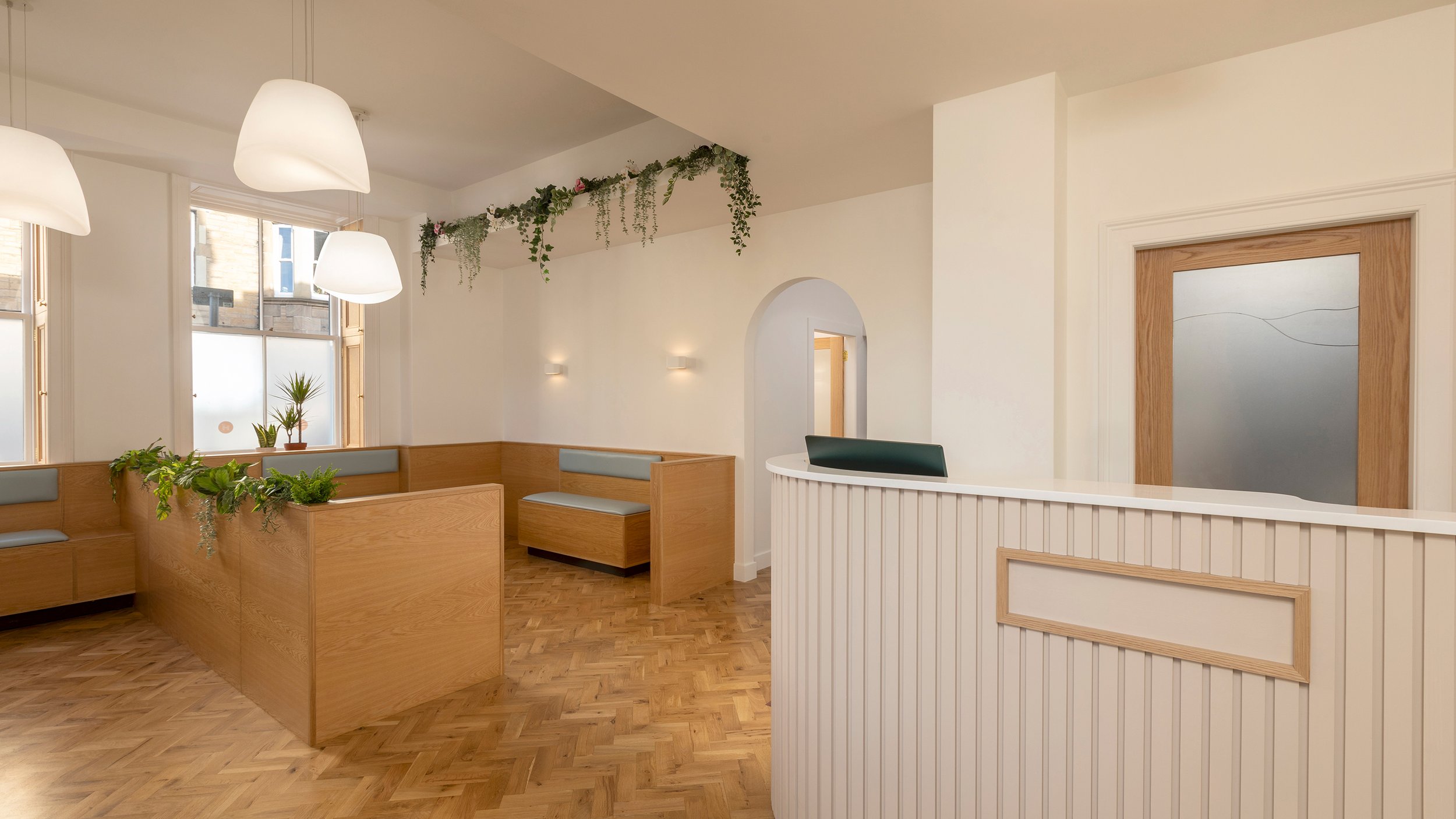
Hill City Vets is located in Edinburgh’s Gorgie area and provides affordable, accessible animal care from a fully-equipped surgery.

Monogram sausage dog derived from ‘H’ and ‘C’


‘H’(ot) Dog
One of our first requests from the client was that their adorable sausage dog, Pickles, was featured somewhere in the practice, so we decided to go one better and feature him in the logo itself. Pickles’ body was crafted from the ‘H’ of the brand typeface and his ear from the lowercase ‘c’ to create an ownable Hill City Vets brand monogram. A sophisticated wordmark completes the brand lockup with the tail of the ‘y’ given an animal-like furriness.
Hill City Vets is named for the hilly nature of the city of Edinburgh, so we have represented this through an abstract set of “hill” patterns which ultimately could have an infinite number of executions. This can be used across walls and other external collateral.
Finally a contrasting pastel colour palette unlike any other in the sector was produced, with these colours interchangeable throughout the brand.


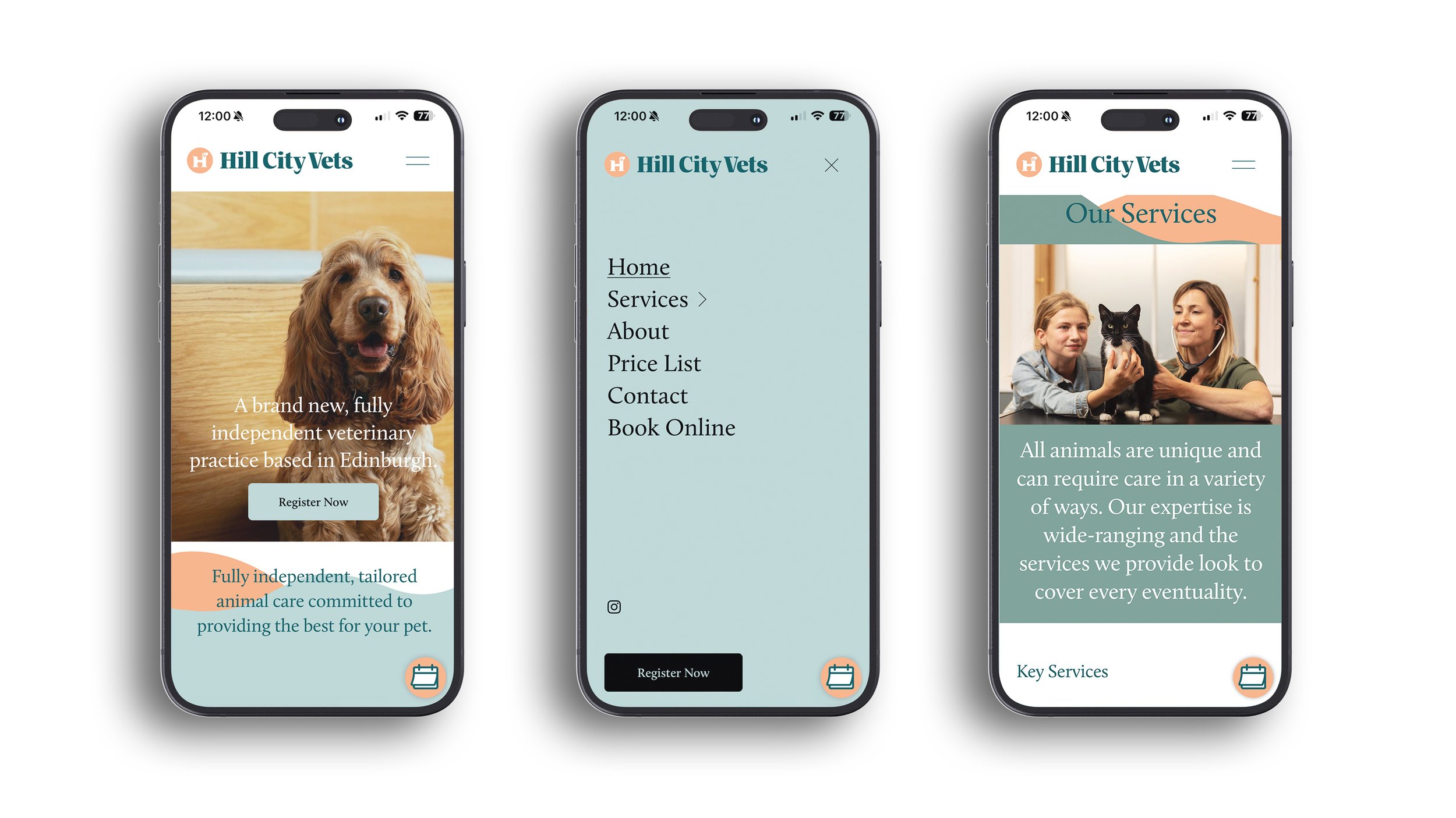
Professional digital presence
As part of the project we designed and built a fully responsive website to ensure this new practice has as professional a look and feel as possible. This utilised the full suite of brand assets as well as a photography set, shot by photographer Angus Bremner, to accompany each page and showcase this beautiful new veterinary practice.


Owner Lindsay Larson and her dog, Pickles
Nice, right?